top of page

Mindful
UX Case Study
The Problem
Workplace stress, long hours, tight deadlines, and pressure from senior management, can seriously damage mental health and isn’t sustainable. We investigated approaches individuals can use to protect and improve their mental well‑being.
The Solution
Build a web app that lets users log their daily moods and receive personalized recommendations for improving mental health. The app will also provide trustworthy resources on various mental health conditions and coping strategies.
My Design Process

My Role: UX/UI Designer / Researcher
Tools: Pencil, paper, Figma
Problem Statement and Hypothesis
Users of the health app Mindful need a simple, private way to track and improve their mental health while coping with workplace stress. We will consider this successful if average daily mood scores increase after regular use of the app’s mood check-in.
Possible Problems
~ Mental health remains stigmatized, so some users may be reluctant to seek help and/or record their feelings
~ Conflicting or low-quality infomration online can confuse user to reduce trust
Proposed Solutions
~ Provide vetted, easy-to-understand resources on mental health conditions (causes, symptoms, and evidence-based coping strategies). Include validated depression and anxiety questionnaires that generate personalized recommendations when completed
~ Offer a simple daily mood check in (ex: very unhappy → very happy). Show progress with clear visualizations (charts/trends) so users can see improvements over time
~ Use gentle reminders: send notifications when a user misses their daily check-in or falls short of activity goals (ex: daily steps) to encourage re-engagement the next day
Business Requirement Document

Competitive Analysis
Bloom focuses on improving sleep and reducing stress, offering strategies aimed at lowering anxiety, depression, and anger. The app provides guided meditation and breathing exercises for relaxation, plus interactive CBT video classes.
User Interviews
I conducted three interviews with potential users to gather attitudinal and qualitative insights and better understand their perspectives.
Key Insights
~ Work is the primary source of stress for all interviewees; senior management repeatedly mentioned as a major stressor
~ Participants want algorithmic, personalized recommendations based on their input. Several specifically requested a mood check-in that could feed those recommendations
~ There was no consistent method among interviewees for managing stress or high anxiety
~ Most participants preferred content delivered as videos or articles
~ Most interviewees engage in physical activity (gym or sports), though activity levels varied
Next Steps
I created an empathy map from these findings to identify user behaviors, needs/goals, and pain points.

Affinity Mapping
Following the empathy maps, I created affinity maps to cluster insights and surface recurring themes, helping clarify participant needs and pain points.

User Personas
Using interview insights, I developed two user personas to represent target users and prioritize features. These personas guided user‑centered design decisions for Mindful. Below is one of the personas I created.
![Persona [Mindful]](https://static.wixstatic.com/media/ccd845_7a2982907b3b4dc0a8156e7c77e3b867~mv2.png/v1/fill/w_980,h_680,al_c,q_90,usm_0.66_1.00_0.01,enc_avif,quality_auto/ccd845_7a2982907b3b4dc0a8156e7c77e3b867~mv2.png)
User Flows
I created user flows to identify required screens and inform the app’s information architecture before design.


Card Sorting
I ran a remote closed card‑sorting workshop (5 categories, 18 topics) to test and refine the app’s information architecture. Five participants completed the exercise (60% Germany, 40% UK). Based on the results, I revised the sitemap accordingly.
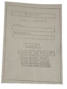
Low-fidelity Wireframes
Sketched on paper to capture high‑level functionality, structure, and navigation before visual design.
Flow 1: New‑starter questionnaire


A user creates an account and completes the New‑Starter questionnaire.
Flow 2: Track your daily mood


A user logs their daily mood and the final screen displays their mood history as a chart.
Mid-fidelity Wireframes
Using Figma, I developed mid‑fidelity wireframes without color or graphics to focus on layout and interaction. I turned them into a prototype to test core features with users and gather feedback for iteration.
![Mid.Fidelity.[Mindful].[p1]](https://static.wixstatic.com/media/ccd845_5a7707f1658d4b53823eb0132066cff1~mv2.png/v1/fill/w_277,h_600,al_c,q_85,usm_0.66_1.00_0.01,enc_avif,quality_auto/ccd845_5a7707f1658d4b53823eb0132066cff1~mv2.png)
![Mid.Fidelity.[Mindful].[p2]](https://static.wixstatic.com/media/ccd845_6405834990b4443c926c585b7f762916~mv2.png/v1/fill/w_277,h_600,al_c,q_85,usm_0.66_1.00_0.01,enc_avif,quality_auto/ccd845_6405834990b4443c926c585b7f762916~mv2.png)
![Mid.Fidelity.[Mindful].[p3]](https://static.wixstatic.com/media/ccd845_c5dd4f14f9eb4358acb3547710c32b65~mv2.png/v1/fill/w_277,h_600,al_c,q_85,usm_0.66_1.00_0.01,enc_avif,quality_auto/ccd845_c5dd4f14f9eb4358acb3547710c32b65~mv2.png)
Usability testing and results
I tested a prototype built from mid-fidelity wireframes to gather evaluative feedback on designs. I collected qualitative feedback during moderated remote sessions. I created an affinity map to cluster comments and surface recurring patterns and themes, then used a rainbow spreadsheet to code and analyze the results for prioritization and iteration.


Findings from usability testing
Participants liked the prototype's features and were able to complete tasks, though some needed assistance.
Testing surfaced issues that required design changes; one example is below.
Feedback: Accessing anxiety resources requires completing the anxiety test.
Severity: 3, Major usability problem.
Suggested change: Make the anxiety resources directly accessible from the home screen.
Evidence: Participant P1 requested direct access, noting they wanted resources without taking the test.
High-fidelity Prototype
After iterating on feedback, I converted the mid-fidelity wireframes into a high-fidelity prototype with color and graphics. The final designs incorporate user and peer feedback, accessibility guidelines, and multiple refinements. Feel free to select the button below to view the high-fidelity prototype
High-fidelity screens


Future development
Secondary research showed a clear link between mental and physical health. Mindful currently focuses on mental wellbeing; future versions would surface physical‑health features more prominently. For example, if a user consistently logs anxiety and stress, the app could suggest high‑intensity exercise (ex: running) and pair that with guidance from a trainer on breathing and recovery.
What went well
User interviews ran smoothly with high engagement, revealing workplace stress as a primary concern that shaped the product direction. Screen transition animations also performed well.
What could have gone better
Creating high‑fidelity wireframes and iterating took longer than expected. I learned that allocating more time for high‑fidelity work and iterations produces better quality.

bottom of page